Project Blog
with artist SammyJo Miller

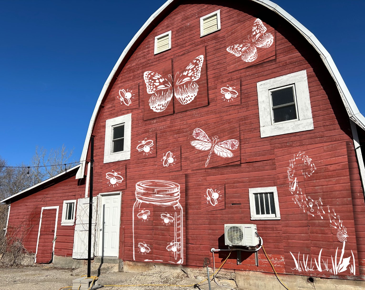
The Painted Prairie Vineyard in Currie, soon to be known as Painted Prarie Vineyard and Estate, has commissioned a custom painted metal sign for the roll out of their new glamping sites and immersive visitor experience.
The process started with a site visit and photographs of the space. After that brief meeting, a few options were drafted for the project.
These option were not what they were envisioning for the space, so we set a more formal meeting. Krista, one of the owners at Painted Prairie, met with me and described her vision more throughly and explained their plans for the future.
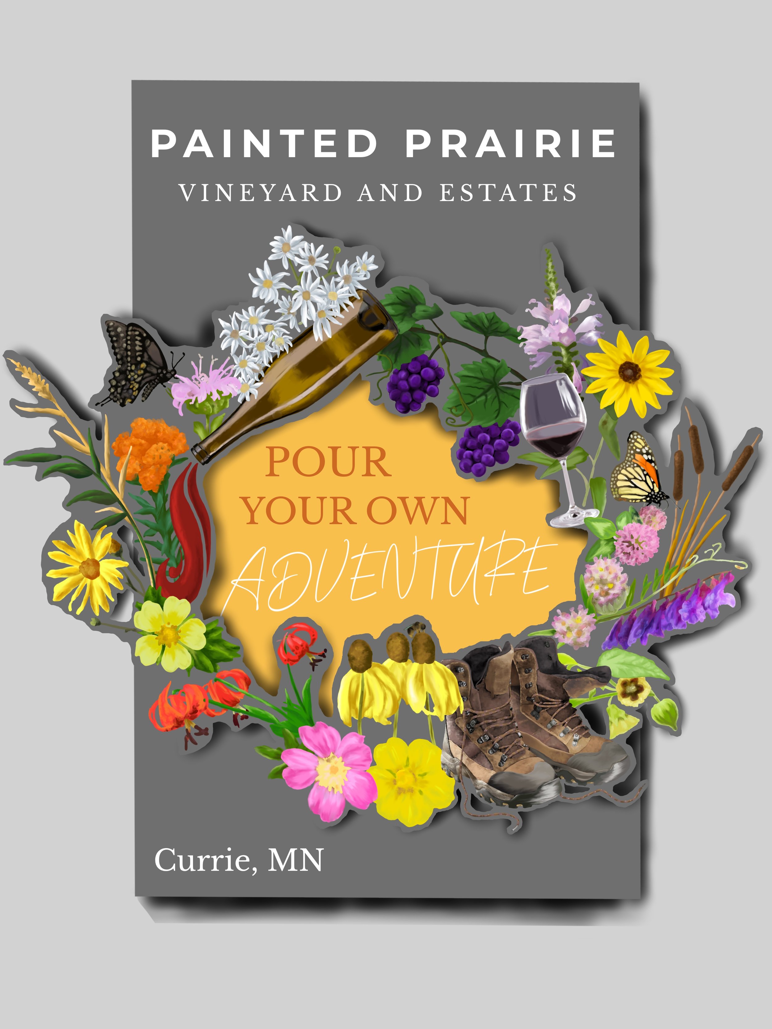
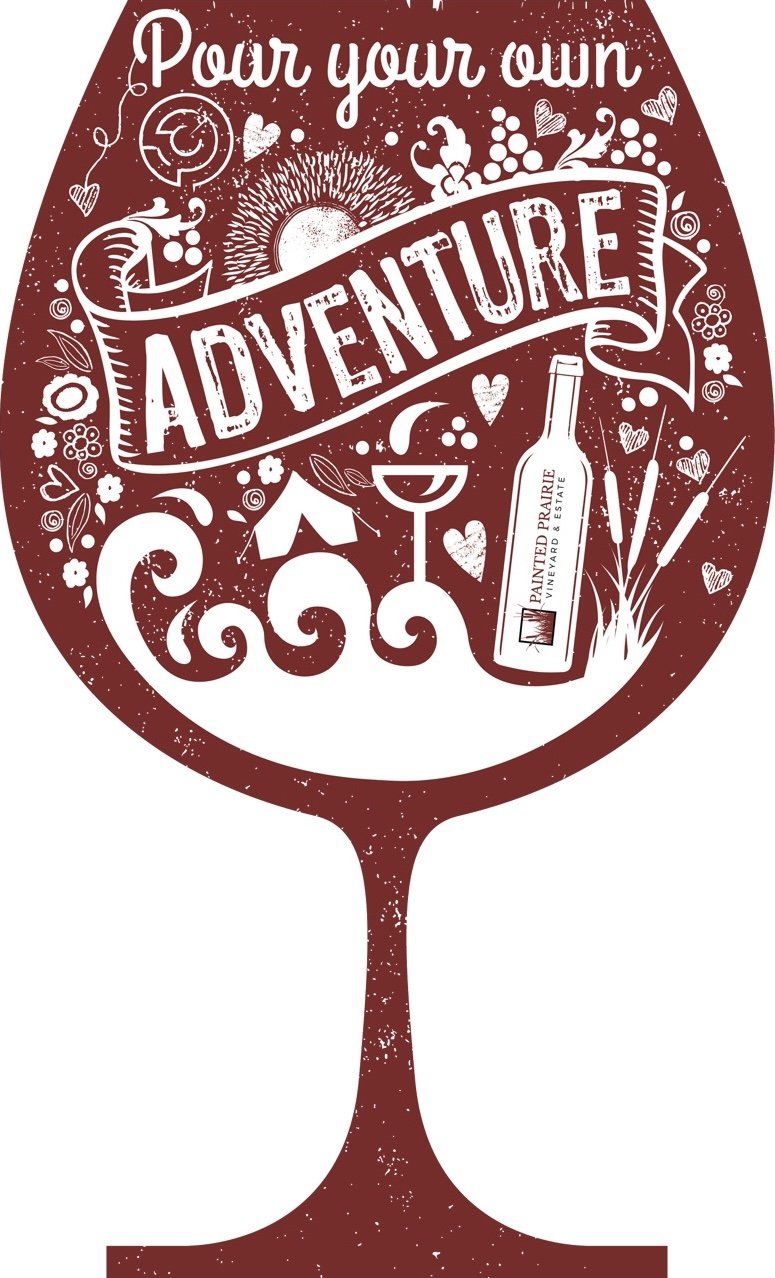
Following the exchange of additional design options, Krista shared the idea with their design team. I am not sure who they use for their marketing and graphics needs, but if I get that information I will share it in a future blog post. They came up with a new concept for the project that fit with their marketing aesthetics. This is what they decided on:
Once the decision was made, the work started. I exchanged a series of emails with my favorite metal suppliers in Minnesota, Midway Iron of St. Cloud. Bryan is so helpful with all my metal projects!

They had to cut multiple wine glasses because the stem of the glass is very thin and the nature of plasma cutting can warp the metal. They provided the best version for me to work with, but a small amount of warping is still evident in the metal. once the piece is mounted the warp will be nearly indistinguishable.
Delivery presented some challenges and I had to resort to plan C, but it is here, in the studio and I am ready to get going!
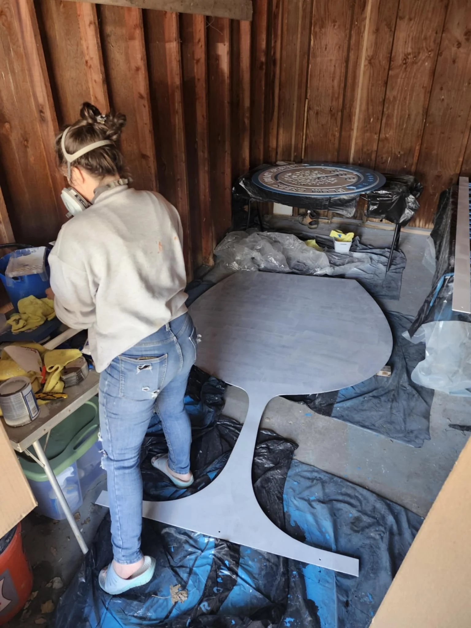
The first step is to give it a good scrub. Using dish soap I washed the wine glass to remove oils and other debris that may affect the primers ability to adhere to the surface. Then I was ready to break out the roller. 2 coats of metal primer and 2 coats of raspberry paint were applied.
Now the magic happens!

The outline was applied with the help of a projector. It allowed me to easily scale the image for transfer. I used white charcoal to outline the image because the background was a darker shade of red and pencil would not have stood out against it.
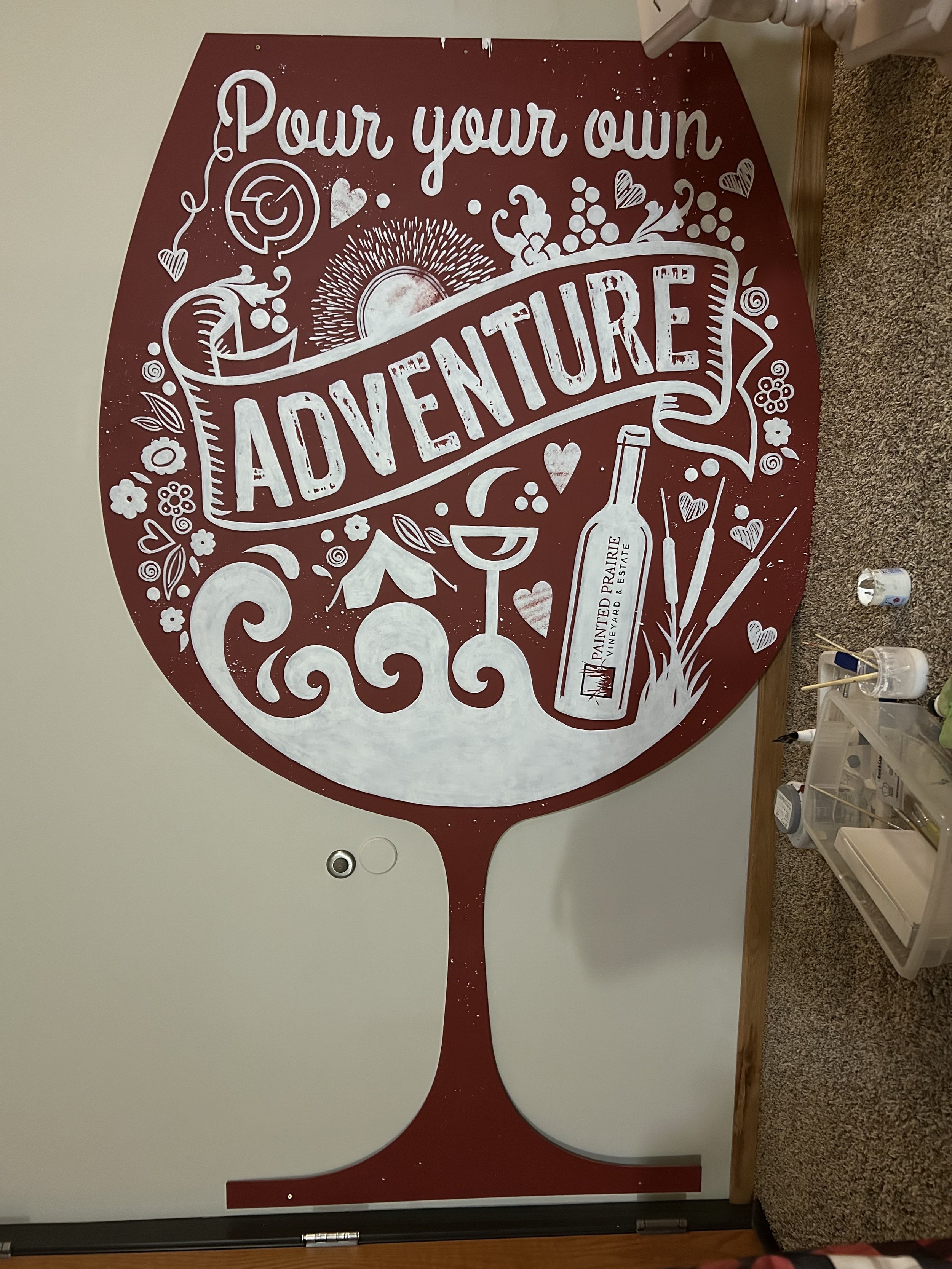
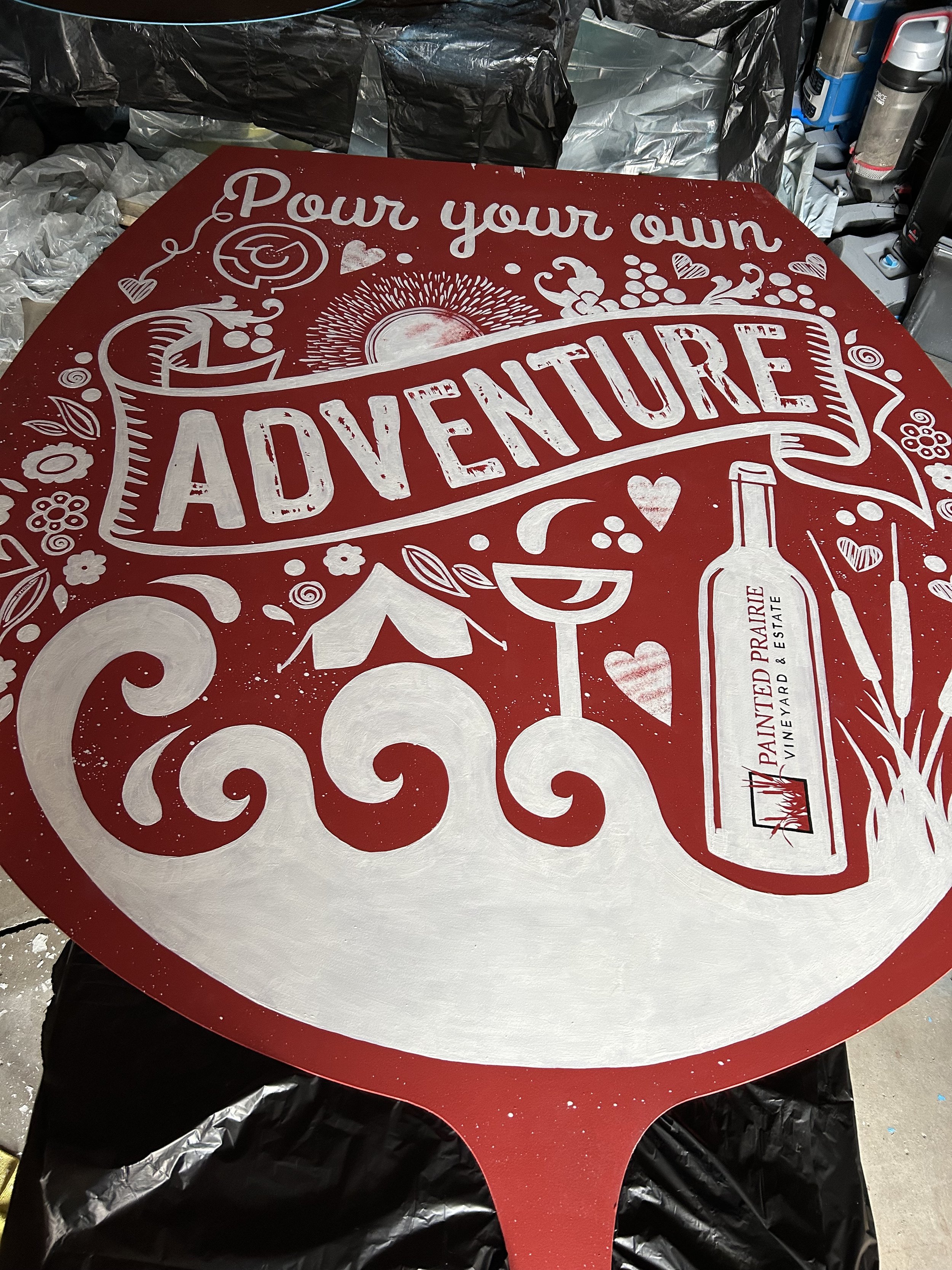
Detail painting began!
It took 2 coats of white paint to achieve the coverage.
After that was completed, I stenciled the new Painted Prairie logo onto the bottle of the wine and very delicately painted the logo and text. You can tell it is hand painted, but I don’t hate it.
The next challenge of this project was texture.

Many methods were used for applying the various textures of the design.
I started with the textures created in the raspberry color. Using a combination of sponge painting and dry brush techniques the texture was added to the sun element and a few of the hearts.
Another texture created in red is the block stamp effect on the letters of the adventure banner. I applied this texture with a brush, using the design as a visual reference.
The last texture in white, is an aging effect, done with a spatter paint technique. This was a lot of fun to produce on such large scale project.
After the texture was applied, the project was moved and prepared for seal coating.
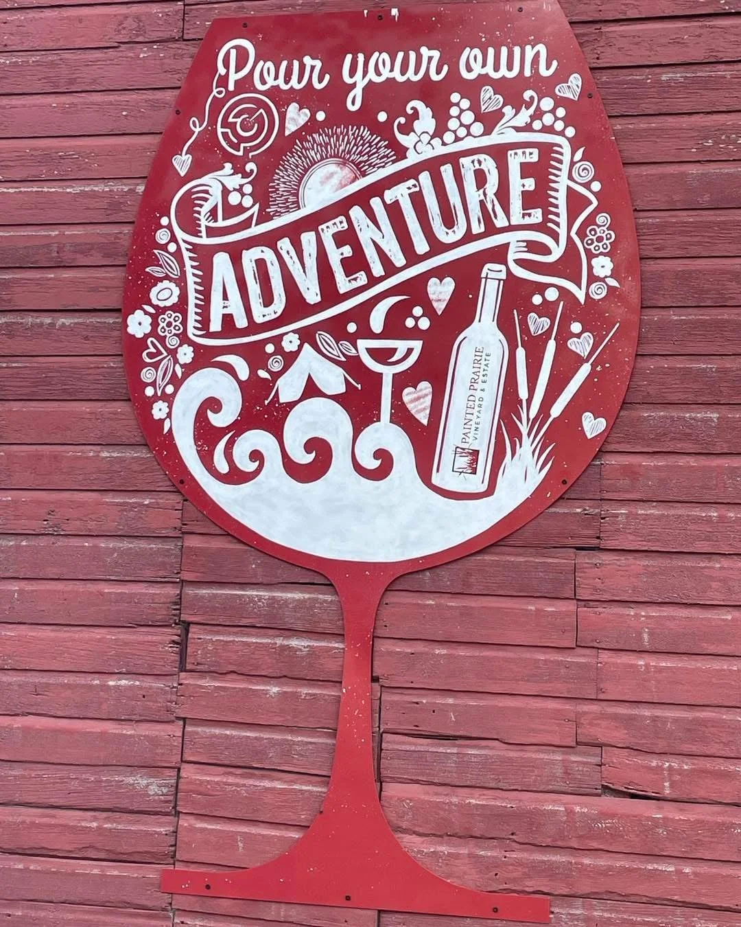
The Painted Prairie Vineyard and Estates sign is officially home!
After completing the final seal coat and allowing it to fully cure, my team delivered the piece to the vineyard, where it now hangs proudly on the barn. Their team mounted it just in time for the launch of their newest experience, Pour Your Own Adventure, a unique glamping getaway that blends rustic charm with curated wine tastings and wide-open prairie skies.
It’s been a joy to see this project through from start to finish. The sign was designed to reflect the vineyard’s welcoming spirit and natural beauty, with hand-painted details, and a touch of whimsy that nods to the creative energy behind their new offerings.
As an artist, there’s something incredibly rewarding about seeing a piece settle into its environment, especially one as thoughtfully designed and community-driven as Painted Prairie. Knowing the sign will greet guests as they begin their own “adventure” out on the prairie feels like the perfect conclusion to this creative journey.
Grateful to the team at Painted Prairie for the trust, enthusiasm, and collaboration along the way. I can’t wait to see how this space continues to grow.